|
|
Location: GUIs >
Windows >
Windows 7 (NT 6.1)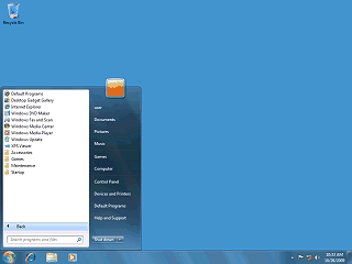
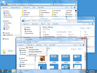
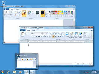
Like Vista, the program menu appears within the start menu itself.
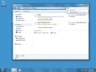
"Search" is no longer in the Start Menu or any right-click context menus. Instead, to search you must use the search box in the upper right of a Windows Explorer window. Also, because the dedicated "Search" window has been eliminated, many of the advanced options are now gone. I don't know about anyone else, but I always ignore these kind of search boxes because in web browsers they may take you to advertising or unknown search engines. On the web if I want to search I click on my handy-dandy "Google Advanced Search" personal bookmark toolbar button.
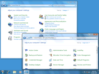
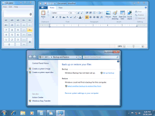
In Windows 7, however, the control panel no longer offers the "classic" view. Instead this is simulated by selecting an optional webby "icon view".
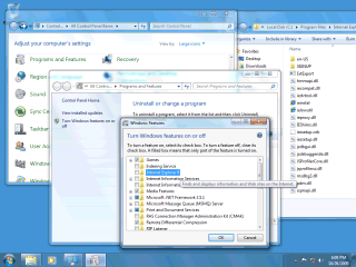
To reflect this, Windows 7 renames the "Add/Remove" control panel item to "Program Features". Interestingly IE can be "removed", but all that does is remove IExplore.exe (which is little more than a loader stub), removes the icons, and unregisters the HTTP shell protocol handlers. IE actually remains and can be embedded by applications (such as the desktop shell). Windows 7e, a version of Windows 7 that claims to exclude the IE application product, "removes" IE in the same way but does not offer the option to re-enable IE. On both Win7 and Win7e dropping the IExplore.exe file in to the Internet Explorer folder is all it takes to be able to invoke the IE front end. Win7e was produced for distribution in Europe due to government concerns but dropped at the last minute due to companies allegedly complaining that it was too different, would break things, and would be harder to support.
The original idea behind menus, popularized by the Apple Lisa and Macintosh, was to provide a consistent user interface that arranged the common functions of almost any application in a more or less standard location, enabling users to learn new applications quickly and easily. But, this is Microsoft, so we can't have that now can we? In fact I rather got the impression that the real purpose behind the Office 2007 "Ribbon" interface was to make money for their training partners, since everybody had to be retrained. A "ribbon" is essentially a tabbed toolbar or tool pallet, which is nothing incredibly new. The main difference with Microsoft's ribbon is that it completely replaces the traditional menu. In theory, once a user memorizes a Ribbon they should be able to access the option they want with fewer clicks. But this advantage seems to outweigh the various disadvantages that I have observed:
Given that Microsoft is willing to make this kind of change, perhaps down the road they will "simplify" the Windows experience further by doing away with all the different localized language Windows versions replacing them with a single, standard, engineered language such as Esperanto (although more likely a bastardized Microsoft extended version of it).
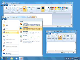
Resizing the window rearranges the hierarchy of items on the ribbon. Functions like saving, undoing, and printing operations are not on the ribbon. When I briefly had to deal with Office 2007 I, nor anyone else could find these functions so I had to help people learn the keyboard commands or add their own custom Office toolbars with buttons for these on them. Windows 7 patches around these issues by adding a "Quick Access Toolbar" that sits on the title bar, as well as a new button next to the ribbon tabs. The Quick Access toolbar display icons (not text) for functions such as New, Open, Save, Print, Undo and Redo. It can also be shown below the ribbon like a normal toolbar. BTW, that square blue and white picture they use for the Save function is called a "floppy disk". People used to store data on devices like those back in the 1980s and 1990s. Also unlike Office 2007, file options can now be accessed through the tab-like button with the picture of the little square white menu-like thingy (oh, that is sooooo much easier to describe than "the File menu")
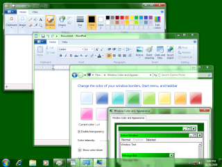
As shown above the ribbon interface fails to conform to any normal or user created color scheme. The exception being when a "high contrast" color scheme is selected.
|
