MacOS X 10.1
Thanks to Jason for the screen
shots!
MacOS 9 was built on the foundation of the original MacOS released in
1984. MacOS X, however, is a new operating system that is built on
the foundation of BSD Unix and incorporates some NeXT technology. This
change was made to eliminate many technical limitations of older MacOS
and in the process much of the user interface was revamped as well.
Click on the images for larger versions.

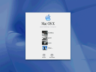
This screen shot shows the login screen. It displays a graphical list
of users that can login on this system. (Interestingly Windows XP does
something similar)
Being based on BSD Unix, MacOS X inherits many useful unix features
such as real security and user accounts.
This means that, for example, you can create a special account for someone
else to play games and don't have to worry about them deleting system files,
accessing your personal files, or changing system setting.
This can be somewhat confusing to users who are used to having complete
control over their systems in earlier versions of MacOS. To do things like
install software you must be logged in as the Administrator. While this
can be annoying it prevents users from accidentally messing up their system
or from malicious programs or viruses that could otherwise infect the system.
There is also a hidden "root" account that has slightly more privileges
than the Administrator, but this is rarely needed.

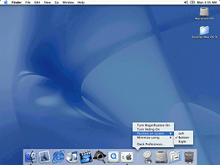
The Dock holds icons for commonly used applications. Moving the mouse over
the icon displays the name of the icon.

The dock also holds icons for minimized windows. Instead of using an
application icon, the icon is a thumbnail picture of the application window.
The ability to minimize windows is new to MacOS X. The lack of this ability
in previous versions stems from maintaining compatibility with the original
Mac OS.

Each window has Close, Minimize and Maximize button on it. The "X",
"-", and "+" symbols only appear when the mouse moves over these buttons.
This behavior is to help reduce the appearance of desktop clutter.

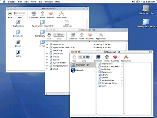
Finder windows can open in one of three different views. The standard
icon view, a detailed list view, or "column view". By default the new finder
browses in a single window, but can optionally browse in multiple windows.
A nice feature of this Finder is that unlike certain other "modern" desktop
/ file managers, it is not a web browser.
The column view is new to MacOS X and inherited from the NeXT user interface.
In column view, starting at the "computer level" each subsequent folder
is shown in a new column. The last column becomes a preview window if a
previewable file is selected.
One of the big changes in the MacOS X user interface (code named Aqua)
is the amount of "eye candy" used. "Eye candy" refers to gradients, background
patterns, animation, and transparency that cause users to go "oooohhhh"
and "ahhhhh" while providing no technical function. However the average
user seems to like "eye candy" so including it helps boost sales.
In the above image you can see an example of transparency in the title
bars of the overlapping windows. Unfortunately animations aren't quite
as easy to show in plain screen shots.
|